Evolution of A Corporate Image
Most railfans, myself included, typically feel that everything was better “back in the day”. One exception that comes to mind is the evolution of the KCS locomotive paint scheme.
The ghost scheme was adopted in 1966 with the delivery of their first SD40’s. In 1989, the KCS changed the primary color to gray and added nose chevrons, but the design did not change.
In early 2007, the KCS adopted a new scheme based on the colors of their “Southern Belle” passenger trains from the 1940’s.
No matter how much you may pine for the “good old days”, you must admit that today’s KCS freight trains look better than they ever have. IMHO, of course.


Its interesting how the railroads think about corporate image. Their image, unlike many other companies, is out there in the public in a pretty intrusive way (crossings, along highways, asking for attention with loud horns, etc.). Because of the merger mania, some pretty radical changes came about that seem to have no reasoning at all (though I’m sure there was some). I think of MKT for example, once red, then a radical transition to the opposite end of the color wheel to green/yellow. BN, when transitioning to BNSF, a radical color change. I can understand the BNSF color shift to something ‘new’ and a departure from both their heritage namesakes, but still quite a radical change.
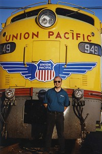
Rock Island, once maroon, red, sort of ugly, then light blue and white. Re-imaging makes for interesting railfan opportunities for sure, often makes little sense to me even as a designer myself. Like them or despise them, at least UP has been consistent and presented a solid public face for ages. KCS has, however, improved greatly as you say, and at least they are drawing from their heritage. Nice to see someone doing so.